top of page

SAM'S SWEET CHILI
branding + packaging concept for a new american-based chili company with thai roots.

i took a minimal approach to the logo, defining the brand using a lightweight sans-serif in order to stand out on grocery store shelves among busier, neighboring products. the stacked shapes on the right are a simplification of the color blocks found on the thai flag, paying homage to the brand's thai origins.


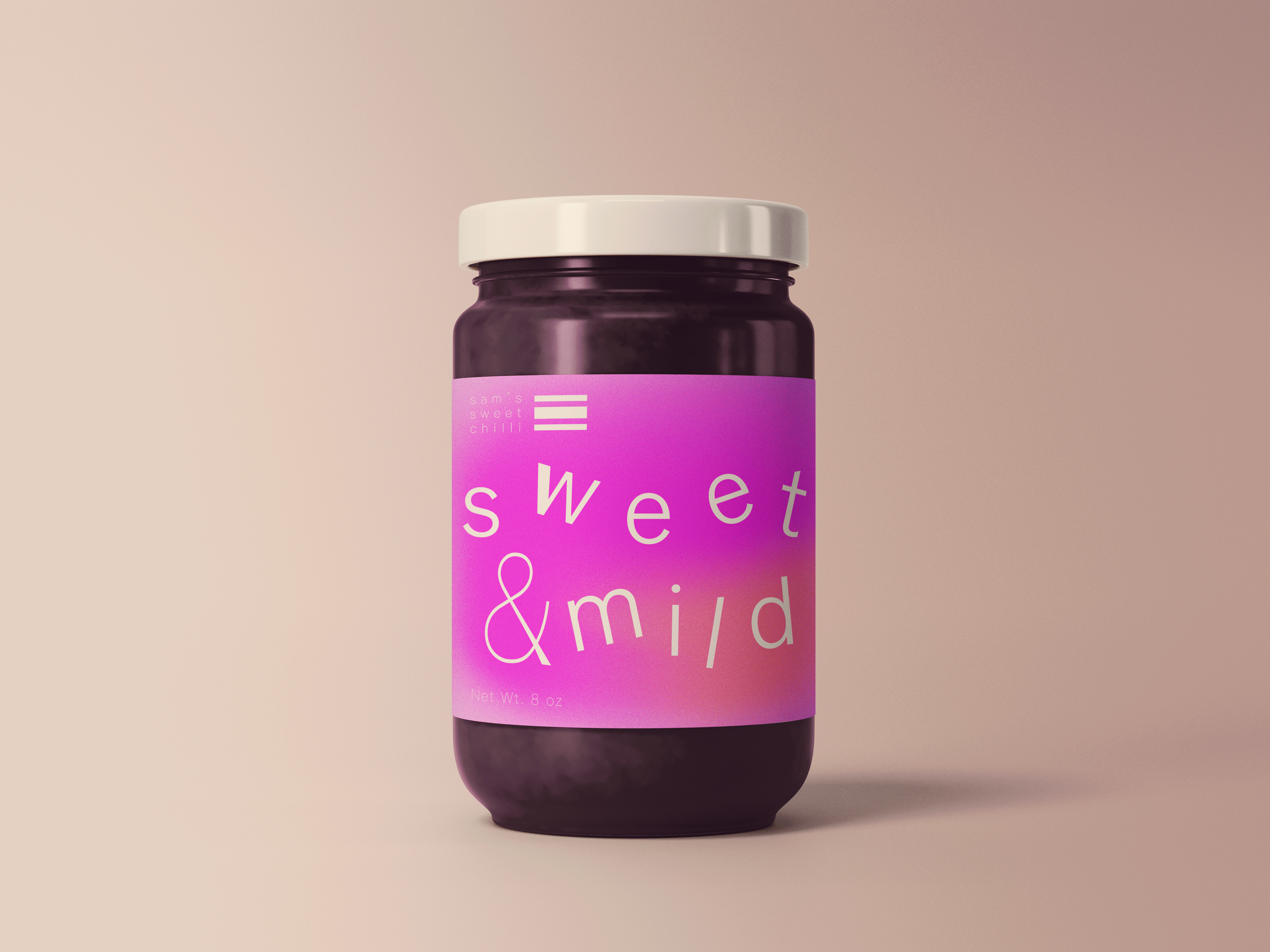
each flavor of chili sauce has its own unique identity to be easily identifiable and memorable. i wanted to take the brand in a new, playful direction, thinking beyond commonplace iconography typically associated with spicy products :)
bottom of page